capture experiences
Easily request and gather photos from shared life experiences
Get Started
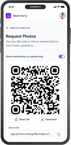
One QR Code.
Everyone's Photos.
Friend Vacation
Wedding
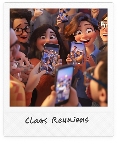
Family Reunion
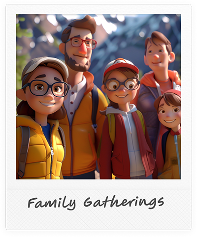
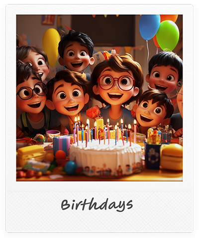
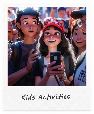
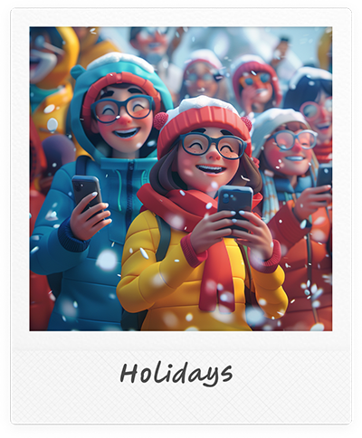
Use PicMe For
Get Started
How to Use PicMe
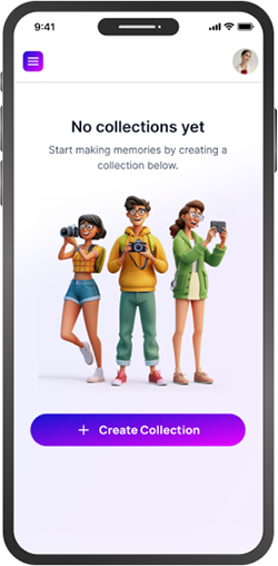
Create a photo collection for the group experience
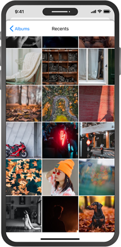
Upload your own photos to the collection
Invite group members to upload their photos
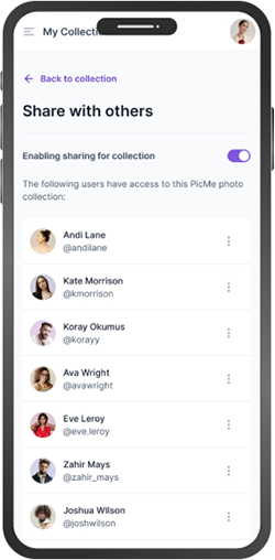
Share the photo collection with the group and others
Relive memories and shared experiences